We are an independent consultancy of urban designers working to create robust and imaginative contributions to the built environment.
We develop responsive masterplans and visions for urban areas with a strong public conscience.
We aim to create distinctive places of exceptional quality through a socially engaged design process.
︎ Home
︎ Recent News
︎ Who We Are
︎ Our Projects
︎ Our Services
♡ Journal
︎ Contact
We are an independent consultancy of urban designers working to create robust and imaginative contributions to the built environment.
We develop responsive masterplans and visions for urban areas with a strong public conscience.
We aim to create distinctive places of exceptional quality through a socially engaged design process.
︎ Home
︎ Recent News
︎ Who We Are
︎ Our Projects
︎ Contact
My Favourite Plan
By Richard Crappsley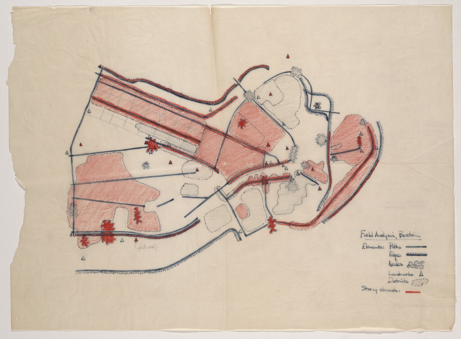
This article originally appeared in issue 168 of the Urban Design Group journal.
The visual form of Boston as seen in the field by Kevin Lynch
This carefully hand-drawn diagram is Lynch’s distillation of his theories of imageability, the physical qualities of a place that evoke a mental image of it and make it legible. In this case, it illustrates Boston in 1959. It is a precursor to the more familiar black-and-white version in his seminal book, The Image of the City.
The plan is in the Massachusetts Institute of Technology’s online archive collection of Lynch’s research into “the individual’s perception of the urban landscape”. A fascinating trove of original hand drawings, notes, and photography by Lynch and his students.
Why I like it
It illustrates ideas that are abstract and difficult to describe clearly in text. Arguably, it’s not even a plan. Although based on Boston’s distinctive geography it renders the city’s elements as a graphic representation. It’s almost abstract, which I find visually intriguing. The lack of scale and north point furthers the abstraction, though I wonder if Lynch let his students get away with such omissions.
It’s a snapshot of Lynch’s emergent thinking - engagingly captured on detail paper - about how to represent city form, but not presented in the now standard symbology. It makes me wonder about the process of reworking it for the book. Note the amoeba-like nodes which are visually similar to some of the districts. These became circles in the book version. Was Lynch trying to convey the sense that some larger nodes are effectively mini-districts? His use of red to highlight ‘strong elements’ is striking, but perhaps less successful than the ‘major’ and ‘minor’ differentiation used subsequently in black and white.
It also captures Boston at a moment in time, yet when I visited Boston some 50 years after Lynch published The Image of the City - and having just recently read it myself - I recognised key elements from the plan. Moreover, despite some major changes in the intervening period, I experienced the imageability of the city in a similar way.
What to learn from it
Lynch’s plan has contributed hugely to urban design practice. Open any urban design report and you’ll find a version of imageability analysis. It’s worth reminding ourselves that the significance lies in understanding the interrelationship of elements to create a whole image. In Lynch’s ideal imageable city paths open up districts, nodes connect paths, edges define districts, and landmarks indicate district cores. This orchestration creates a vivid image and makes it legible. You can see this in neighbourhoods like Back Bay (top left corner). Conversely, blank areas with free-floating elements lack imageability, therefore suggest where urban design improvements might be needed.
It is also worth reflecting on the importance of the observer. The plan presents an identity, structure and meaning of Boston based on Lynch’s field research. Similar diagrams based on interviews and mental-mapping exercises with Bostonians show many similarities, but also differences. Eagle-eyed readers may spot the faint annotation indicating that a red triangle should be "not red”. A drafting error perhaps, but we could also imagine that Lynch’s perception of this landmark changed for some reason. It’s a tiny reminder of the subjectivity of experience shaping the image of the city.
— Richard Crappsley, Associate Director.